Responsive Web Design Principles
Responsive web design involves designing websites that offer the best user experience across all screen sizes. Responsive web design differs from other techniques such as creating a mobile version of a website, because it shows the user the exact same website (that is, the site is served from the same address, using the same HTML whether a user is viewing on a mobile or a desktop) rather than detecting their device and redirecting them to a different optimised website.
Google has stated in their website design guidelines that responsive web design is preferable, because it avoids multiple websites with duplicate content and saves resources.
FLUID GRID SYSTEMS
One of the main principles of responsive web design is designing to a fluid grid system. Traditional websites, when viewed on a small screen, require the user to “pinch and zoom” and scroll horizontally in order to read the text and content on the page.
If a website is designed to a specific grid, then each column of that grid can be made to behave differently on different devices / screen sizes.
For example, on a desktop screen you may have a website that has a 3 columns next to eachother. However, on a mobile devices those columns, if kept next to eachother will become extremely narrow. Instead, on mobile, it’s best to stack these columns on top of eachother making a single column grid, and requiring the user to scroll down the page to see the content.
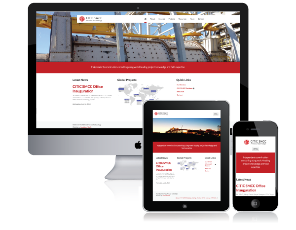
The example below shows this in action on the website Loudbox Media made for Minerals Processing Consulting Company CITIC SMCC. On desktop and tablet “Latest News” “Global Projects” and “Quick Links” sit next to eachother. However, on mobile these latest news takes up the whole width of the screen, and Global Projects and Quick Links are loaded at full width below.
An example of the fluid grid system used in the Bootstrap 3 framework can be found here. Resize your browser’s window size to see what happens to each of the columns at different sizes.
HIDING AESTHETIC ELEMENTS TO OPTIMISE SCREEN REAL ESTATE AND USER GOALS
On a desktop screen, you have a lot of screen real estate to play with. To engage the website visitor, we often use large imagery on the homepage using an image rotator. This works because we have a lot of space to play with and large image rotator will probably still only take up half the screen. However, on a mobile device where screen real estate is a precious commodity, image rotators, which won’t give the same impact that a large desktop screen will, can often be removed to make way for more important content.
It is also important to think about each user and their goals and their goals in the context of their device. If a user is viewing on a mobile device, they are less likely to be viewing just to generally browse your site, scroll through pictures etc. They are much more likely to be looking for quick information about your organisation or business, like pricing for a particular product, address or contact details, or to read an article that you’ve published. Therefore, it’s important to consider if there are any elements on the page (again, like an image rotator) that hinder the user on a small screen size from accessing the vital content on your site quickly. Take a look below for how we’ve done this in a website for a Brisbane-based Audio Visual Installation Company Hart Automation’s website.

WE SHOULD CONSIDER MOBILE VISITORS FIRST
This final point seems somewhat counter-intuitive. On many of the sites we monitor, on average about 25% of visitors are using a mobile device, leaving (obviously) 75% of website visitors using non-mobile device.
The blaringly obvious approach here would be to cater to the majority of your visitors, right?
While that logic is used a lot throughout the web design process, it’s not as applicable here. The reason is that if we design for desktops first and view mobile visitors as a secondary priority, we tend to pack our designs full of features and functionality that work beautifully for desktops but don’t necessarily “scale down” very well. We then start making compromises based on functionality limitations in our designs rather than design decisions based on our end users’ goals.
Instead, we cater to our lowest common denominator first—mobile—and then expand on our design from there.
Joshua Johnson from Design Shack puts it eloquently:
“With a mobile first viewpoint, we start by loading the absolute bare essentials on the smaller platforms. This leads to a snappier experience that avoids unnecessary lag. The additional resources are loaded strictly on an as-needed basis to platforms that can handle them well.”
SOMETIMES THINGS GET DRASTIC
While we push mobile-responsive design heavily, we appreciate that on occasion a mobile-responsive web design approach just doesn’t give the user experience required for some applications. Sometimes your mobile users will have vastly different and distinguishable goals than people who are viewing on a desktop, and a collapsible grid system just doesn’t cut it. In these circumstances you need to completely change the way your website behaves and offer a distinctly different template, set of information, goals and navigation to your users. While not going in to too much detail about that here, such situation may call for a native mobile app, or user-agent detection to serve a completely different website.
Got some thoughts on the future of mobile devices and web design? Let us know on Twitter @loudboxmedia
Or if you're interested, check out some mobile-responsive web design in action